Key Takeaways
-
An entrance sign should identify the property and help visitors make the next correct move.
-
Readable lettering, contrast, spacing, and placement are more important than decorative complexity.
-
A coordinated sign system works better than relying on one large sign to solve every navigation need.
-
Materials should match the architecture, climate exposure, maintenance plan, and expected lifespan.
-
Accessibility, lighting, landscaping, permits, and sight lines belong in the early planning process.
Table Of Contents
-
Why The Entrance Sets The Tone
-
How Signs Help People Find The Right Place
-
Design Features That Improve Readability
-
Accessibility And Clear Information
-
Choosing Materials For Vancouver Sites
-
Placement, Lighting, And Landscaping
-
A Simple Planning Process
-
Common Mistakes To Avoid
-
When Professional Input Helps
In Vancouver, Washington, an entrance sign often has to work through rain, changing daylight, roadside traffic, and a visitor’s first uncertainty about where to turn. For a business, neighborhood, school, medical office, or public destination, the right sign does more than announce a name. It gives people a clear, reassuring starting point.
For property owners planning a monument sign Vancouver WA project, Garrett Sign Company provides a useful local point of reference. Its Monument Signs service is part of a broader design, fabrication, and installation offering for permanent signage, with work serving the Vancouver, Washington, and Portland, Oregon, area. That practical experience matters when an entrance marker must suit the site, support a recognizable identity, and remain visible through Pacific Northwest weather.
Why The Entrance Sets The Tone
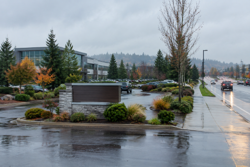
The entrance is usually the first physical point of contact between a visitor and a property. A clear sign can make an office park feel organized, an apartment community easier to enter, or a school campus less intimidating for a first-time family. At a retail center, it can distinguish the primary driveway from an exit. At a clinic, it can help visitors slow down before they miss the correct turn.
The strongest entrance signs support their surroundings instead of competing with them. A masonry base may complement brick architecture. A clean metal structure may better fit a modern commercial building. In either case, the sign should establish a sense of place without overpowering nearby homes, landscaping, or public space.
How Signs Help People Find The Right Place
Wayfinding is the process of helping people understand where they are, where they need to go, and how to get there. An entrance sign is one part of that process, not the complete solution. Visitors may arrive by car, bicycle, rideshare, or on foot, and each approach creates a different viewing angle and decision point.
Give Each Sign A Clear Job
-
Identification signs name the business, campus, development, or public place.
-
Entrance signs establish the proper arrival point and welcome visitors.
-
Directional signs guide people toward parking, buildings, accessible entries, pickup areas, or exits.
-
Directory signs organize tenant names, departments, suite numbers, or multiple destinations.
A large entrance marker cannot explain every turn on a busy property. The better approach is a consistent sequence: identify the destination at the street, confirm the entrance at the driveway, then direct visitors at key internal intersections.

Design Features That Improve Readability
People often read entrance signs while moving, which makes clarity essential. Letter size should reflect the intended viewing distance and the speed of approaching traffic. High contrast between letters and their background helps the message stand out, while adequate spacing prevents words from blending together at a glance.
-
Choose straightforward typefaces that remain legible from several angles.
-
Keep the main message short, then place secondary details on directional or directory signs.
-
Use logos and brand colors to reinforce recognition, but do not let them crowd the property name.
-
Design for the actual approach view, not only for a close-up rendering on a screen.
Accessibility And Clear Information
Accessibility should be considered before a layout is finalized. Clear contrast, controlled glare, predictable placement, and direct arrows help more people use a site with confidence. Exterior entrance signs do not all have identical requirements, because the applicable standards depend on the sign’s purpose, location, and relationship to an accessible route.
Projects that include room identification, permanent interior information, or accessible-route guidance should be reviewed against the official ADA sign standards. Early review can prevent a visually appealing sign system from becoming confusing or difficult to update later.
Choosing Materials For Vancouver Sites
Vancouver’s wet seasons and changing temperatures make material selection a practical design decision. The best choice depends on exposure, architecture, maintenance capacity, and whether the sign needs illumination or changeable panels.
-
Aluminum: A lightweight option for many exterior sign faces and fabricated elements.
-
Steel: Suitable when a design needs substantial structural support or a heavier visual presence.
-
Brick, stone, or concrete: Often effective for permanent neighborhood, campus, and community entrances.
-
Composite materials: Can offer flexibility where weight, finish options, or maintenance are key concerns.
Compare options by more than initial cost. Consider moisture exposure, cleaning methods, finish durability, repair access, color retention, and whether replacement parts can be added without rebuilding the entire sign.
Placement, Lighting, And Landscaping
Placement determines whether a sign can actually do its job. Traffic speed, turning lanes, driveway geometry, grade changes, and the distance from the road all influence how early a driver can read the message. Trees, utility poles, parked vehicles, and seasonal plant growth can block a sign that looked perfect during installation.
Lighting extends usability into dark winter afternoons and evenings, but fixtures should illuminate the message without creating glare for drivers or nearby residents. Landscaping should frame the structure, soften its base, and preserve an open sight line. Before fabrication, review setbacks, height limits, illumination rules, easements, and permit needs through the City of Vancouver’s permit and inspection guidance.
A Simple Planning Process
-
Define the task: Identify whether the sign must welcome, identify, direct, or organize.
-
Study every approach: Walk and drive the site from the street, sidewalk, parking areas, and main entries.
-
Limit the message: Include only the information a visitor needs at that location.
-
Review local requirements: Confirm permits, zoning, height, setbacks, and electrical needs.
-
Match the site: Select a visual style and materials that fit the building and landscape.
-
Plan ahead: Allow for tenant changes, new buildings, updated branding, and maintenance access.
Common Mistakes To Avoid
-
Putting too many words on the main entrance sign.
-
Using decorative lettering that is difficult to read from a distance.
-
Ignoring a curve, hill, landscaping, or parked vehicles that block visibility.
-
Adding lighting that causes glare rather than clarity.
-
Forgetting pedestrian routes, accessible entrances, and internal direction signs.
-
Selecting materials solely on the lowest initial price.
When Professional Input Helps
A qualified sign professional can connect the design with site conditions, fabrication methods, installation access, permitting, and long-term service needs. Bring entrance photos, property plans, brand guidelines, known code details, desired message content, and a preliminary budget to the first conversation. Ask how the design addresses visibility, foundations, lighting, maintenance, and future changes.
An effective entrance sign is both a visual marker and a navigation tool. When readability, local character, durability, and visitor needs work together, a Vancouver property feels easier to understand before anyone reaches the front door.